Here’s an example of logo evolution. I was given an original logo that had been around for many years. I started with a similar theme and tweaked it a bit, then since the company is global, decided to use a high tech globe theme. it went through several iterations including a fairly different version that took it in a whole new direction.
Take a look at how this one progressed:
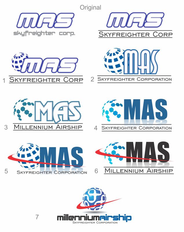
Since MAS stood for Millennium AirShip, but was not really easy to figure out from just the initials, I tried a version that spelled it out, using the original font that the client liked. Thus the last version. High tech, global and modern.
Comments are closed